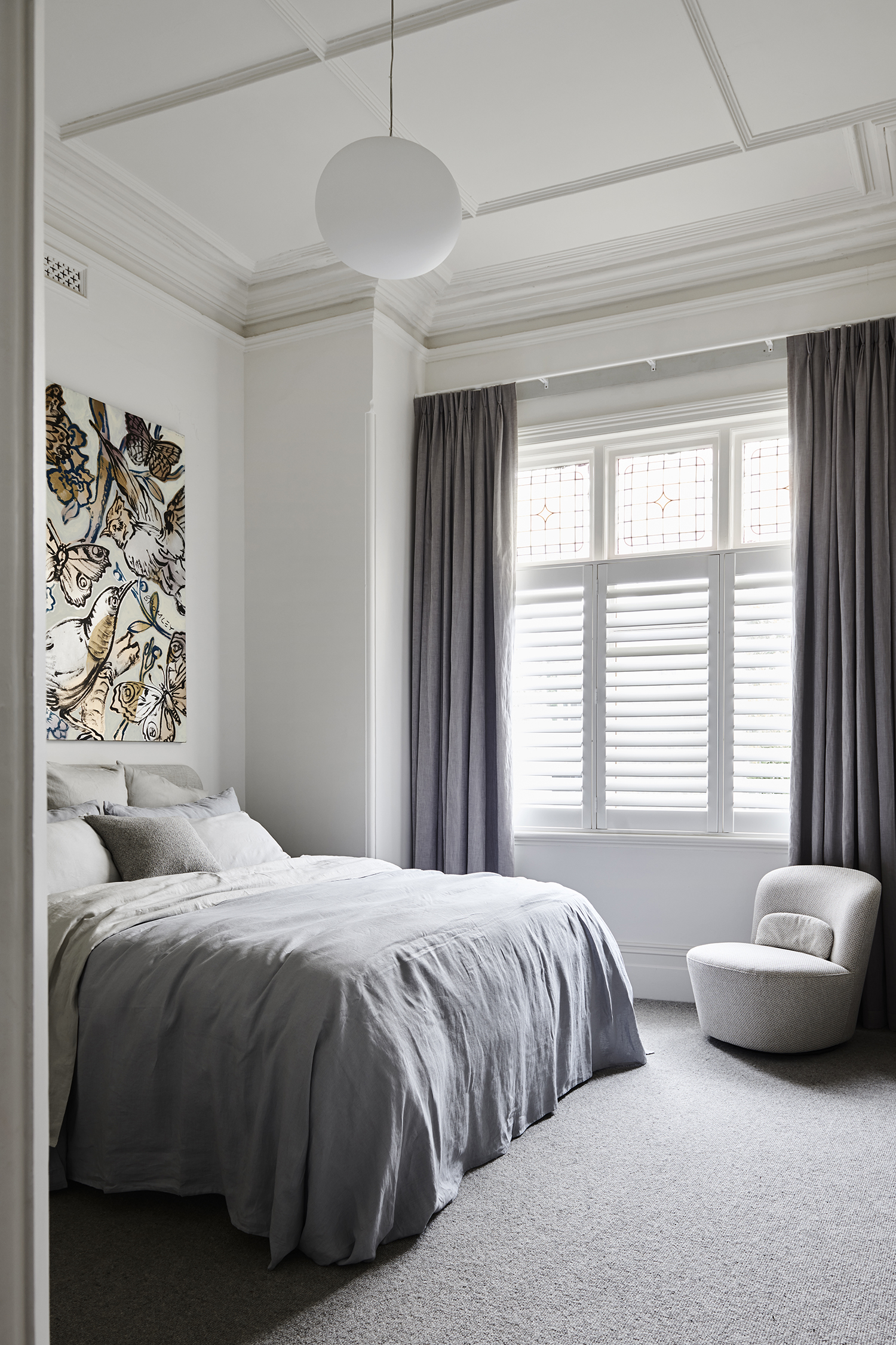
Bed linen by Abode / chair Brosa Ada chair
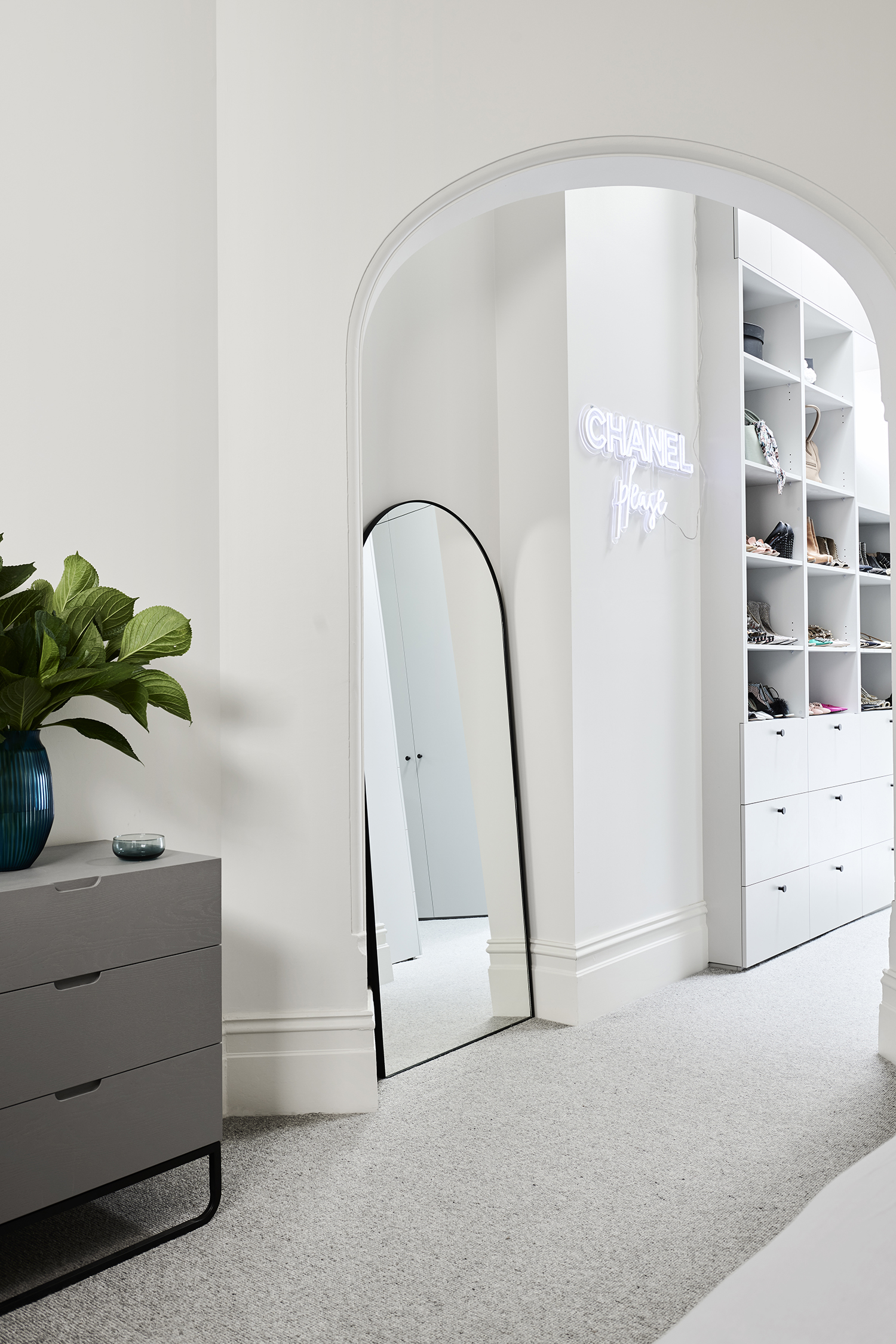
Neon sign Custom Neon / side table Brosa
We have never been ‘floor boards in bedroom’ people. Josh and I always talk about how cosy it is to step into a lush carpeted bedroom and even though our beach house is, well, at the beach, the sandy feet isn’t stopping us from carpeting that renovation either.
I am the worst at selecting anything that involves colour and thankfully, Cassie (my interior designer, in case you haven’t been following along) selected everything for me. I don’t know what it is about the fear of colour for me, perhaps it’s the commitment and I get scared I can’t turn back! Either way, my bedroom is very neutral, warm yet cool and ultra comfy.
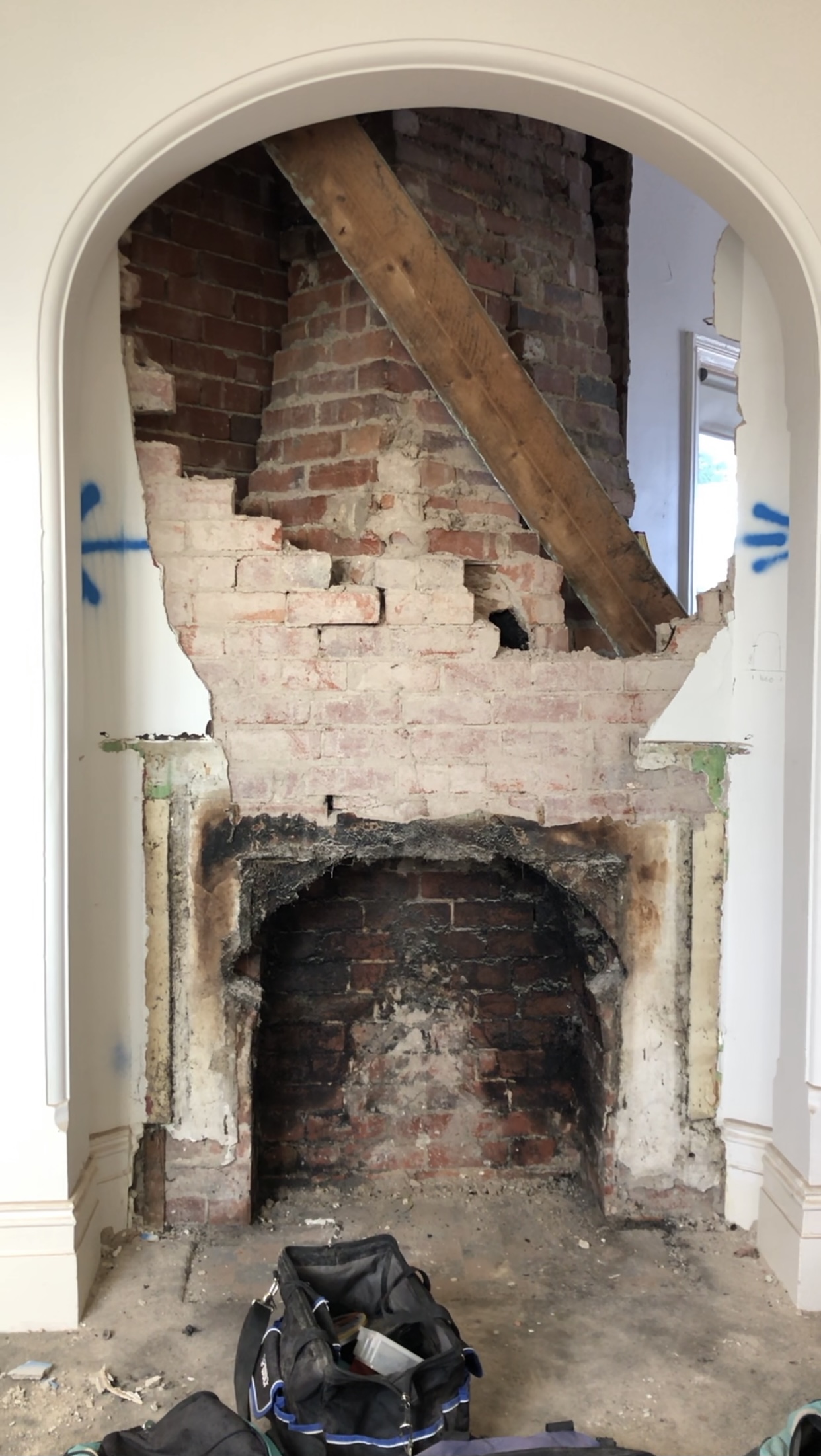
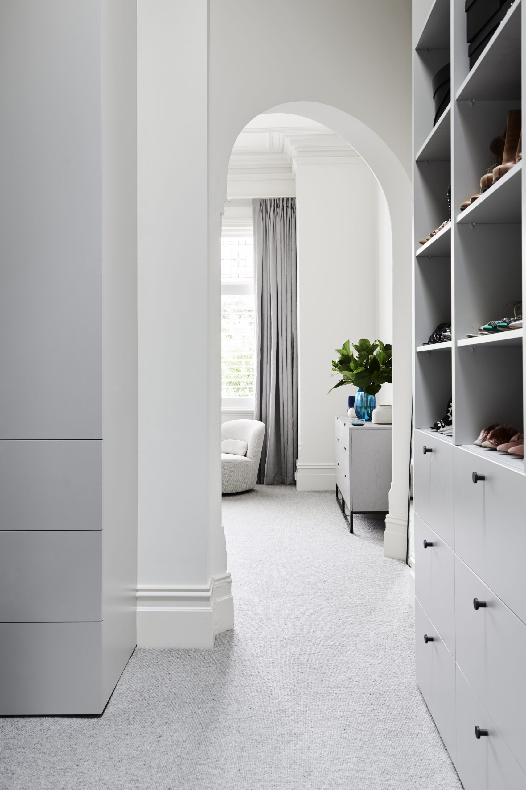
The bedroom revolved around two things, the arch door way, which was origionally not in the plans. It was a fire place wall, with the arch and I was going to square the room off (Take away the angle where the arch is) and add a steel french door into the WIR. I was also going to have my bed on the opposite side wall, but because we worked out we could keep the arch and make it a walk way into the WIR, it soon became the ‘hero’ and I was happy to move my bed to another wall.
The second main feature for this room was always going to be my Bromley paintings. I am a huge fan of David Bromley, I got my first piece of art (the Hillary, that is in my living room) for my 30th birthday, 8 years ago and since then, I have collected more. The birds for the bedroom were a custom comission pieces and were very thoughtful for this room. In fact, I origionally wanted David to do a wall mural on my bed head wall, maybe one day!
The bed head was designed to accompany the artwork and was a custom bed head by Bonne Nuit which also pays tribute to the soft roundness touch points that are found in the house.
All up, I adore my bedroom, I love that I spend so much time in a room that has so much of its heritage details, from the skirting, to the detailed ceilings and thick architraves to the colourful lead light window.
Curtains: Mokum Antipodes in colour Pacific by Lynch Window Fashions
Carpet: Oakford Square Prestige Carpets ‘Eldon’
WIR joinery: Oakwood Kitchens oyster grey laminate
Linear Standard handles ‘bell’
Wall colour: Dulux Natural White
Pendant Light: Lights Lights Lights
Builder: Clancy Constructions
Designer: Cassandra Walker
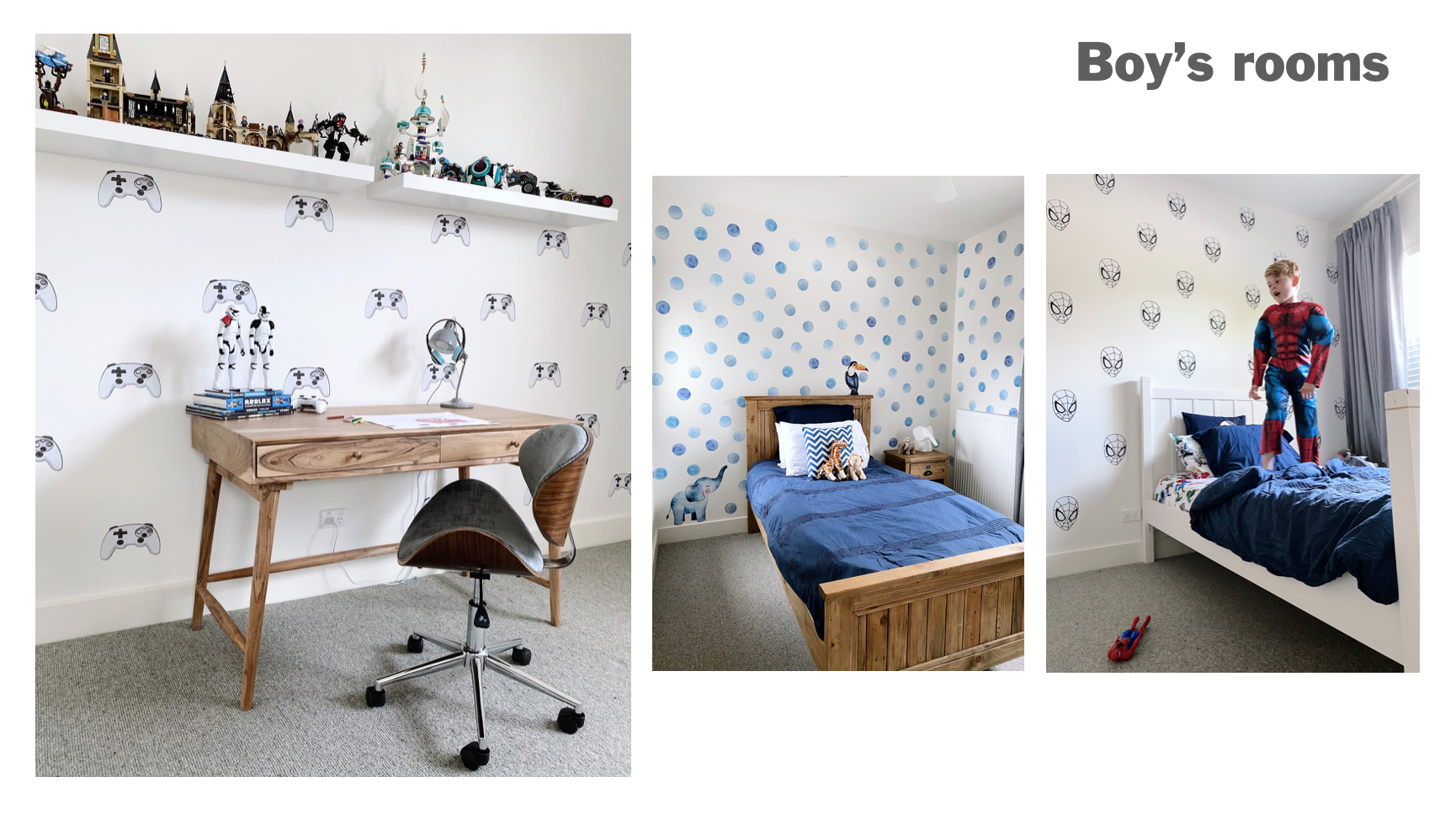
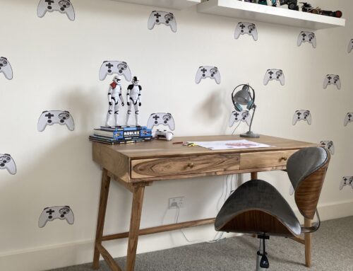
Touching back on my earlier conversation to you about being scared to commit to colour, well, upstairs is pretty basic. I wanted to keep the boys bedrooms as minimal as possible while they are young and as they grow, I could look at adding some paint to their walls and tune in to their individual personalities. For now, I added some temporary wall decals from Pickawall for each of their rooms with a little hint of what they love right now.
We actually have a 5th bedroom that is our spare bedroom but one day would like to turn in to a sitting room for Josh, something masculine and chesterfield-y, if you know what I mean.


Leave A Comment